Lampstand Studios — 2025
Lampstand Studios
A brand identity for a Christian podcast studio built to shine a light and spark honest conversations.
The brand need
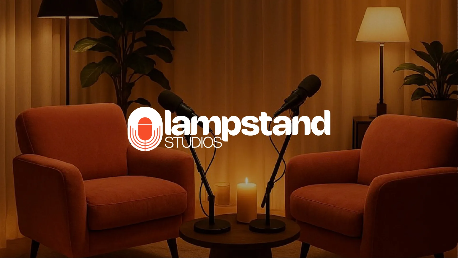
Lampstand Studios is a Christian podcast studio with a clear mission: to be a light — hosting honest conversations about the Christian life and how to be a positive influence. The brand needed to feel youthful, warm and inviting, and to carry a spiritual meaning without feeling heavy or dated — a look that could live across podcast art, a physical set and everyday merch.
The solution
A brand identity for a Christian podcast studio built to shine a light and spark honest conversations.
Process
-
Step 01 Setting the direction
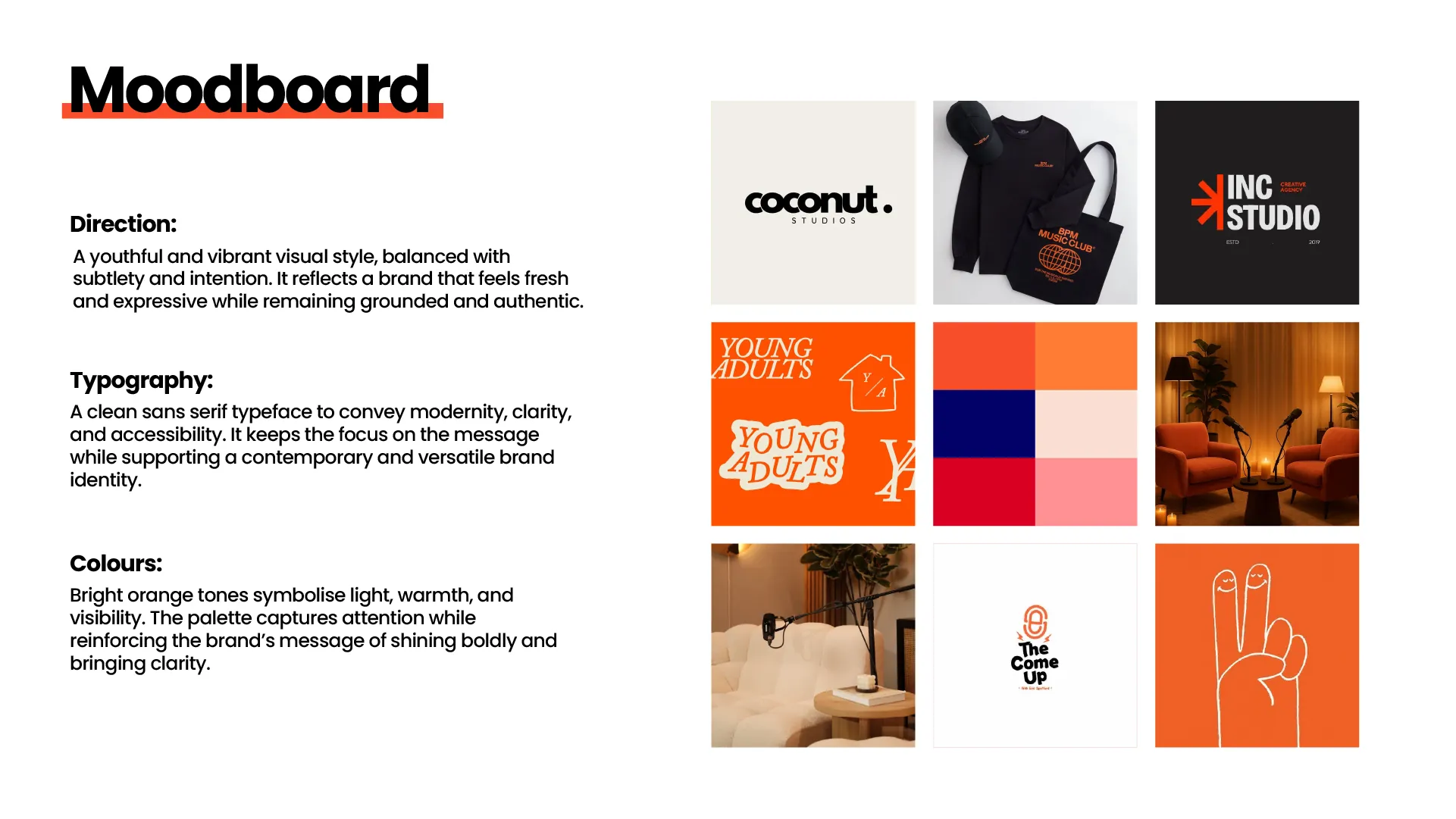
A moodboard fixed the tone: youthful and vibrant but grounded, a clean sans-serif for clarity, and a bright-orange palette chosen to symbolise light, warmth and visibility — the brand shining boldly.
-
Step 02 A logomark with a story
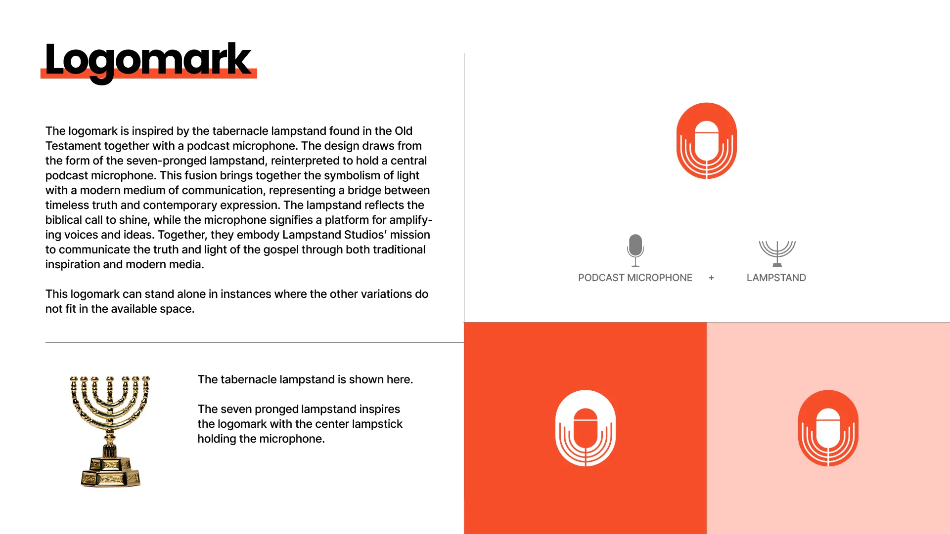
The logomark fuses a podcast microphone with the seven-branched tabernacle lampstand of the Old Testament — the biblical call to shine meets a modern medium for amplifying voices, bridging timeless truth and contemporary expression.
-
Step 03 A warm, complete system
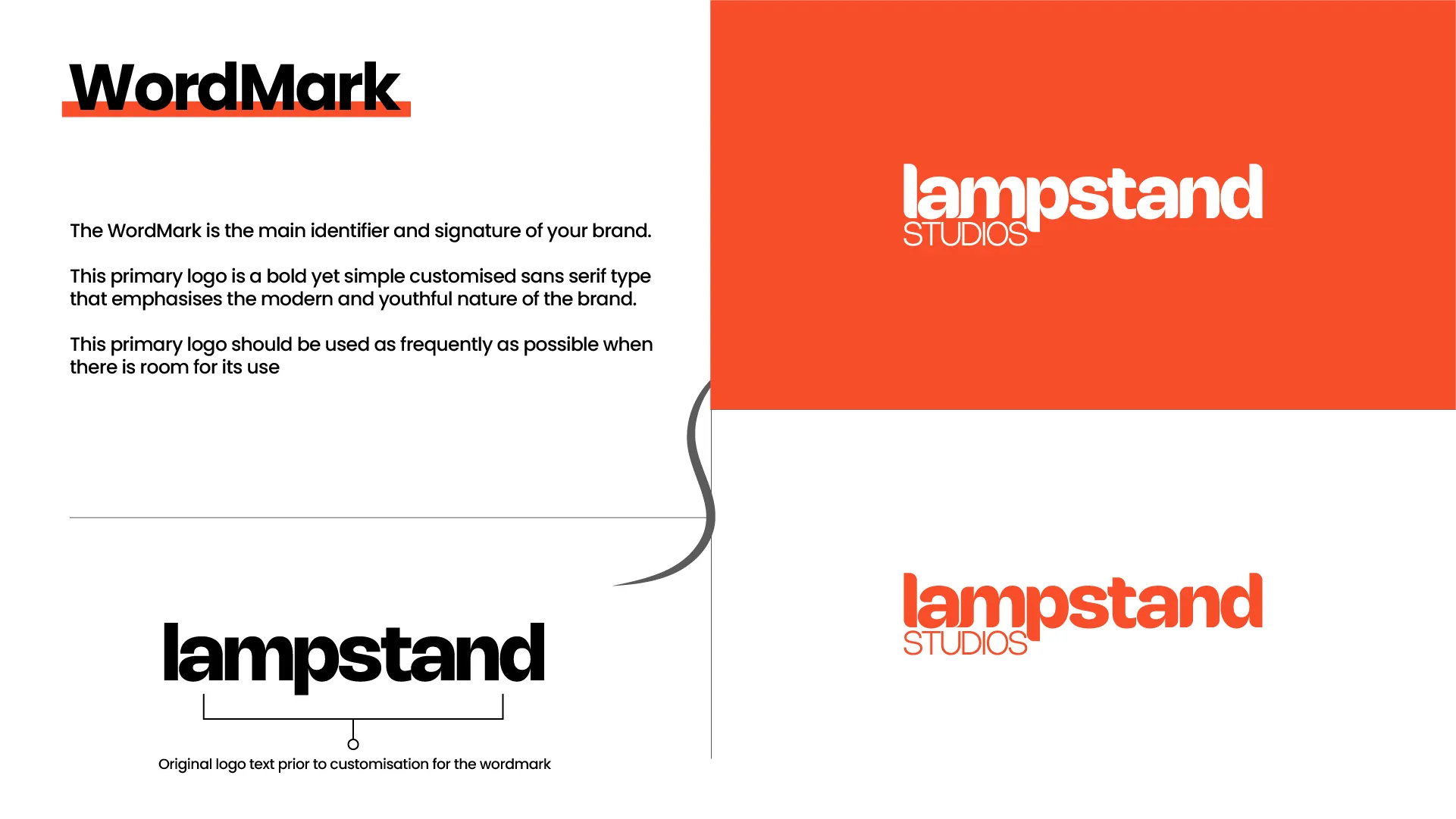
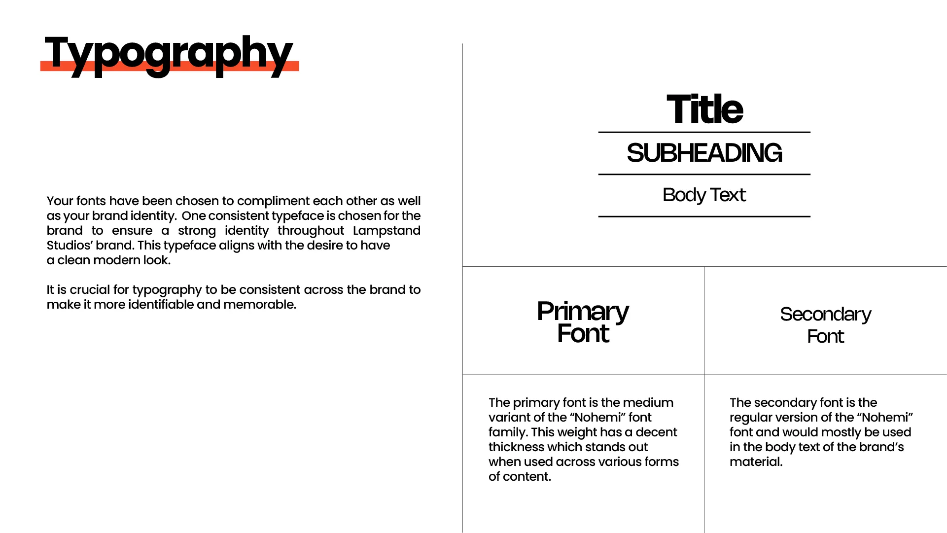
A customised sans-serif wordmark, the Nohemi typeface and the orange palette come together across the identity — from the glowing, candle-lit podcast set to the full logo lockups — so Lampstand feels consistent on a thumbnail or in the room.
Outcome
The result is a warm, contemporary identity that carries real meaning: a mark that literally shines, a palette built on light, and a system flexible enough to run from podcast art to the studio set — giving Lampstand a voice that feels both rooted and current.